Artwork #2: Appropriate

xXx Throwback 2 Quizilla xXx

xXx Throwback 2 Quizilla xXx

This game was made as an appropriation to the days of 2004-2010, when Quizilla was at its peak popularity. The website was used for mainly creating quizzes and writing stories. The site was used by many newer or popular fandoms of the time along with the emo scene. The game was made to mimic the quizzes of those times which were a series of questions and then a result in the end and the most popular quizzes had the taker get a result where they’re told that they have a certain power or end up with a handsome fictional character. The stories were all about a mediocre teenage girl who was stubborn and had attitude so instead of taking the route of those stories in which she gains 5-13 different powers, I made that all the questions would turn the player into a NPC in the interesting new world they were transported to instead of being a key player.

The game was made to mimic that style, but instead of having those happy endings or the instant suicide or cutting your wrists endings, I wanted to make the player always feel like they’re in limbo and thus never getting an end state that’s satisfactory or even considered an end state, but in respect to the medium I continuously gave the player commentary on their choices for some sort feedback even if it’s negative feedback.

The movement that I took inspiration from was the New York Dada movement because they had a focus on wit and humor using some sort of irony. However my main take away from the New York Dada movement was the movement’s criticism of forms of art by making fun of it with mimicry. Next are the works that I used to take inspiration from for my writing. The two that I used were Etant donnes and Fresh Widow by Marcel DuChamp. I used Etant donnes because Duchamp made a magical world over an impossible spanish wood door to point out war and the rise of fascism, but the viewer can only see it through a crack or peephole in the door and I used the idea of making a magical world, but only to block it off and have the players not do anything  to create a frustration in my players. Next was Fresh Widow, which was a play on French Window and was a way to point out war and the romantic idea of soldiers going to war and their wives waiting for them. The inspiration that I took from the piece was to remove the romantic idea of escapism from these quizzes and the idea that there is a happy ending in the end of all the effort of answering questions.

Documentation

For my playtests, I’d ask them if they had been on Quizilla when it was still active, Or if their only experience were with Buzzfeed quizzes as it would give me some insight if the participant knew the type of humor and style of the ‘choose your own adventure’ disguised as a quiz with the appropriated general style of 2006-08.

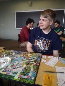
The first person who played my game didn’t use Quizilla, but was familiar with the style of humor that I was trying to emulate and during the playtest.

Observations: There were a fair amount of eyerolls and mutters of ‘why?” Some chuckles mainly at the beginning.

Feedback: It changes too quickly from being nice to being cruel and dismissive. I (the playtester) wasn’t into the emo scene or depression scene back in the day so I guess maybe try to make it more surprising by making the first 3 questions nice and then attack the player at the drink questions

The second player is someone I’ve known for more than 10 years. They did go on Quizilla when they were in elementary school.

Observations: A bit of staring back and forth between the screen and my face. A fair amount of skepticism in the beginning then an elongated ‘oh’ when the person figured out what I was trying to appropriate.

Feedback: Called me a loser in a loving way and then called me a sell-out. The person actually asked me “Why didn’t the player commit suicide as one of the endings?”. At first I took the feedback as a joke, but then I started actually thinking about it.

I wasn’t sure what to make of this feedback because back when this style of humor was popular, it was commonplace for an abrupt end or all of the ends in the game be that the character is brutally killed or commits suicide. I wouldn’t be comfortable writing these scenarios now. However if I had to completely mimic the style in the game, I would have added it in, but since times are different and thankfully evolved past depression memes, I kept with the humor and style of the game just with minor edits.

Feminist Dress Up

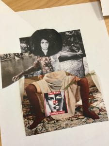
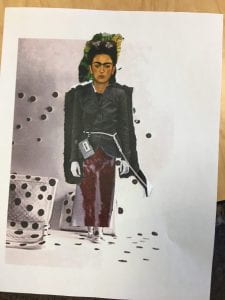
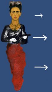
For my game featuring appropriation I chose to make a dress up game utilizing images from famous feminist artworks. While I chose the majority of my images based on the work’s expression of the artist’s own self-expression and relation to gender. overall I am very happy with the chosen works, especially with how harshly they contradict the traditional dress up game with the common inclusion of nudity or blood.

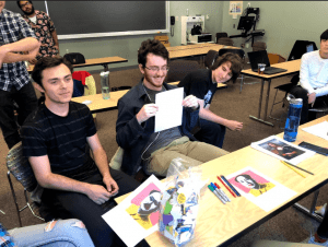
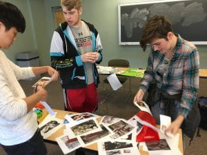
Classmates actively collaging An example of one of the collages A second collage example


Initially I started with a physical version, scaling all of the source images to be comparably to scale, and had my classmates cut and clue parts of the images to create their own feminist artist. I was surprised with how well this activity turned out, with the flexibility of the physical medium offering unique combinations like different arms or feet that I hadn’t thought of for the digital version. I also love how the final products include the background of the various images, setting the characters in a scene. Initially I was conflicted on whether or not I should choose to cut the pieces out before hand, but found the physical act of cutting and gluing the collage to be powerful.

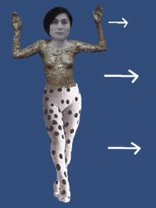
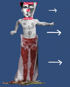
An example of the digital game. An example of the digital game. An example of the digital game.

For the digital version of the game I chose to use unity, and make a relatively simple character creation in which you could customize the head, torso, and legs of your character. While I love the immediacy of seeing the different combinations, in the future I hope to continue adding to the game to polish it, eventually adding a submit screen that would show the original works behind the parts you chose and a brief explanation of each work and its artist respectively.

Overall I took a lot of inspiration from a number of different Dada artists and their appropriation. Hannah Höch was particularly inspirational. I loved the aesthetic of Cut with the Dada Kitchen Knife through the Last Weimar Beer-Belly Cultural Epoch in Germany in addition to The Beautiful Girl being an amazing feminist collage. Max Ernst’s Sacred Conversations, Man Ray’s Coat Stand, George Grosz and John Heartfield’s The Middle-Class Philistine Heartfield Gone Wild, and Marcel Duchamp’s Nude Descending a Staircase, No 2 all served as great examples of the abstraction of the female form using collage and assembly, in addition to the question of the objectification of the female form. Overall while the combination of the individual works is up to the participant, I hope the resource of works provided allow for some kind of education or curiosity about the artists behind them and all the work that they have created.

Adventure to Unusual Articles

3-10 players
10 – 40 minutes

Play Rules:

  • Have everyone start at a completely random Wikipedia article. This can be done through this link
  • Choose a category in Wikipedia’s list of unusual articles
  • Have everyone choose an article within the category. This a your goal page. This is the page you want to move towards. This is to be kept secret.
  • Whoever got to the random page gets to be the first leader
  • Everyone else chooses a link they want to go through and offers it to the leader
  • The leader chooses a link from those offered by the other players
  • Everyone goes through the chosen link and whoever offered the link becomes the new leader

How to Win:

  • If you come to a page that links to your goal page, you win!

Optionally Tabletop-RPGesque Elements (for fun and profit):

Begin the game by having each player choose a person and place. (They must have a Wikipedia page) They will role play as that person and be from that place. The players should use this role as a way of backing up their link decisions. (Example: As Barbra Streisand from the isle of Jersey I think it would be smart if everyone else learned about my role in the film Funny Girl.)

Documentation:

So far 3 playtests have been run of this game. Here is the link history for the three of them:

Hendricks County Flyer Hell,Michigan Anupama Niranjana
North Salem, Indiana Paradise, Michigan Kannada Literature
Population Density Sufjan Stevens 20th Century in literature
Inbreeding Interstate 278 Genre Fiction
Adult Robert Moses Apocalyptic and Post-Apocalyptic Fiction
Voting Post World War II Economic Boom Metro 2033
No Land! No House! No Vote! Baby Boom Special Edtion
Capetown Birth Control List of Video Game collector and limited items
2004 Summer Olympics Coitus Interruptus PlayStation 4
Jacques Rogge Penis PlayStation 4 System Software
Internet Censorship in China Koro (ran out of time)
Great Firewall
Classified Information
For Official Use Only
Freedom of Information Act
Fedspeak

The first play test didn’t use the category rule, so it took a bit longer. On the last playtest we ran out of time so we just saw who could get to their page first.

Here’s the document I used to design the game

Artist Statement:

The initial conception of this game came from a normal visit to Wikipedia. Knowing I had to make an appropriation game (and in some bout of desperation) I established Wikipedia as the medium of choice. A few games have used Wikipedia, the most famous being the almost poetic Wiki Game. That has simple rules: Start on page A, go to page B using links fastest. I adore the wiki game both as a concept and as an actual experience. Any game that uses the internet as its play space like the Wiki Game or GeoGuesser continues to inspire me. It’s from the basic concept of the Wiki Game that this game was appropriated from.

So that’s where the “materials” come from. The conceptual basis of the game is the Exquisite Corpse. The wiki game is an individual race; it can be done alone with no inherit difference in experience. I wanted to make that experience collaborative. Having everyone follow the same links that the group decides to go through changes the dynamics  of moving from A to B in Wikipedia. The mechanic of having every link decision decided by two people is another example of adding collaboration into the game. The effect of this is that the group creates a path instead of an individual. The path through links on Wikipedia might have less artistic merit then a drawing or poem that the Exquisite Corpse used but it’s a creation none the less.

The path that is created playing this game is something of a collaborative montage. Not in the sense of film but in the broader definition that the Berlin Dadaist worked in. A path is a collection of disparate ideas that miraculously have defined connection to each-other by the inherent fact that they are found within a path. The individual articles are just stepping stones to the next one, bereft of meaning beyond a name and a link. That same feeling is remarkably close to Hannah Hoch’s photo-montages that take letters and headlines from newspapers without regard for the totality of the articles. Cut with the kitchen knife is the first piece that came to mind when I though of the game’s product in this way. 3D montages like Grosz’s and Heartfield’s Elektro-mechan or much of the work of Raoul Hausmann is also conceptual similar.

Finally, this work is simple enough to be considered a score. I would be lying if I said that had an effect on the creation of the original game, but when I was simplifying the rules for quicker games the rules became more and more like a score. The game has shocking similarities with Ono’s Map Piece, something about the openness and use of preexisting mediums used in unintended ways lends itself to similarities with Ono’s and Fluxus as a whole… although it was not consciously made.

The Game of Life on the Oregon Trail

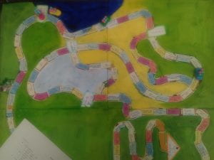
My game consisted of an analog version of The Oregon Trail, made on a Game of Life board, with Life pieces and money. I wanted to recreate a famous digital game as a board game; the fact that Oregon Trail was originally a text-based game was also interesting, as a board game seemed like an evolutionary step, between text and computer game, that didn’t exist. As I researched and read articles from the designer who helped make the text game a computer game, I realized how complicated the mechanics were behind the scenes, and I tried to simply them while also making the elements of chance visible.

This is part of my appropriated Game of Life board (in horrible phone-photo quality):

The rules are here.

Iterations:

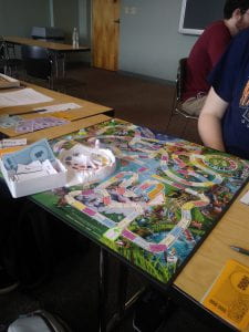
I playtested first in class. This helped to work out some kinks, such as the options for moving, the too-small food denominations, and the ease of replenishing food through the minigame. (Since my dartboard had not yet come in, we played paper football, which was too easy, especially since you could Hunt and Move each turn.) Also, no party members died, which does not accurately reflect the Oregon Trail game, so I decided to make it more difficult. The guest teacher suggested that there be automatic death from dysentery, which I thought was a good idea so I changed those sickness tiles to death tiles.

I playtested the new game with my friends once my dart board arrived. It worked a lot better, but was still very slow, which led to the fact that you can move twice if you have 2+ oxen. This also fixed a problem we ran into where a player got stuck since they had to keep hunting for food and then immediately paying that food to the bank, leaving no room for them to move forward since they had nothing to trade. I also noticed that there was a lot of leftover money, so I changed the starting money to what it was originally.  I also removed the requirement to stop at every fort, because it became redundant and equalized where people were too much. This was a good playtest because they were constantly trying to push boundaries, asking if they could resurrect or eat their dead members, or eat the oxen, which forced me to make more explicit rules.

Statement:

This game came about by thinking of what to appropriate. Originally I wanted to make a game about appropriation, but decided that using actual appropriation would be better-suited to a smaller project. I decided on Oregon Trail because it’s iconic as a computer game, and also because I had recently played it and wondered at how and why things happened, and saw its potential as  group game because my roomie and I were playing separately at the same time and updating each other on our progress. I chose the Life board because it fit well with the cars and people, and the new version with pets was perfect for the oxen. I ended up painting over most of the board and covering all the spaces with my Oregon Trail text copied from the 1971 game (the text was shortened to fit and I changed “Indian” from the game to “Native American”). Since the hunting minigame was an important part of bringing the game from text to computer, I wanted that to be skill-based, and decided appropriating darts would work well.

The idea of taking something and using it against its purpose was an aspect of Dada and Fluxus, and I was especially thinking of Duchamp’s readymade Bicycle Wheel, which in combining two objects made them useless. In this case, the Game of Life board was no longer playable as that game, but as a new one (Oregon Trail) that was in a different format than it was created in. The collaborative way my friends and I added and subtracted rules mid-game also seemed to speak to the collaborative, sometimes spontaneous entertainment performed in the Cabaret Voltaire.

Project 2 – Magical Canvas

Artist Statement

My game appropriates the art in Magic: The Gathering cards. I love the art of MTG cards, but during normal game play the art doesn’t serve a functional purpose. I took some influence from Richard Prince’s cowboy picture in which he cut the text out of the cigarette add to make a nice picture. I took inspiration from this in deciding that ignoring the text on the cards and only looking at the art was the goal of the game. I did not feel like it was worth cutting out the art as by leaving the art in the card frame makes the game playable by anyone with magic cards and means you can use any cards without worrying about ruining their monetary value. I also think the act of deliberately having to ignore the normally important text brings the contrast between my game and standard game play. This further highlights that his is not normal use for the cards. 

The game is also made cooperative as the idea of taking a medium normally used for competitive play is a worthwhile contrast to make. Collages and tapestries are often collaborative works and represent a shared story. I took inspiration from Hausmann, Baader and Hoch and their photo montages in the Munich Dada scene. Though they didn’t make collaborative works, the montages are collections of pictures or words that make new pieces of art and appropriate other pieces of art. The end result of playing “Magical Canvas” is a montage of magic cards that tell a story. It takes many different artists and puts their work together into a new story.

I think my chosen appropriated material works well for my game and my purpose. Many people have some amount of Magic cards around their house, and this gives these old, often forgotten, cards a purpose. By giving the cards that most people toss aside as bulk commons and uncommons a new meaning, my game gives people something to play that uses all of their cards by re-framing how you use them. Both play tests of my game led to wild and unpredictable stories, and the ad-lib nature of the stories it makes lets them be free and honest expressions.

Play test overviews:


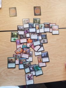
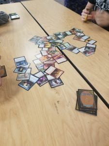
The first play test led to some on the spot rules changes from the original rules. The group came together and told a story of the bugle rock concert led by lead bugle player Johanes and his tree drummer Kimmothy. The cops showed up and shut it down with their sniper and the attendees scattered while the place burned down. One of the fans, Jeremy, joined the cops and fought a burning Kimothy until Johanes came to save the day. Johanes and Jeremy experiences a flash forward in a moment of hesitation in which they saw their future child and then rode off into the sunset to get married.


The second play test started with the burning of the flowers by the flower hating king. A dragon appeared and helped burn things but a brave fire-immune knight showed up and beat the dragon with a spear of flame. Her wife showed up to congratulate her and was immediately killed in the next card in a true “bury your gays” moment. I ended up losing track of the story as multiple plot thread then appeared and the group jumped from story to story within this world all branching from the original setting.


Final rules

Magical Canvas


Materials

  • 1 deck of magic cards of at least 60 cards with no lands
    • Each player may bring a small deck of 30+ cards for personal use, but there must be a shared deck for the table.
  • 5 different land cards


Preparing the Deck

  1. Take bulk magic cards
  2. Pick at least 60 cards with art you like
    1. If you would like to have artistic consistency for your game, pick cards from the same set or block. Feel free to mix and match as you please.
  3. Put them into a deck without any lands
  4. Shuffle the deck


Preparing the Tapestry

  1. Shuffle the 5 land cards
  2. Place them face down on the table in any arrangement with no two cards touching
  3. As a group, decide on which card to flip face up. This is the starting location of the story


Gameplay

  1. Everyone draws 5 cards from either the shared deck or their own personal deck
  2. Starting with the player who has most recently taken a picture for social media, play progresses to the right
  3. When it is your turn and before you play a card from your hand, you may put on card onto the bottom of the deck and draw a new one
  4. Place 1 card from your hand onto the tapestry
  5. If the card is touching a face down card, flip it face up
  6. Using only the art on your card, describe what new part of the story the art represents. You must incorporate any cards that it is touching into the story.
  7. When you are done telling the next part of the story, draw a card and play passes to the next player.

Ending the Game:

The game is over when you finish the story. Take a picture of the canvas to remember the story and then shuffle all the cards back up returning them to their original owners.

Tips for Storytelling

  1. Follow the “yes and” rule. Don’t take your turn to subtract from the story. Use each turn to add new elements.
  2. The art represents some part of the story. Just because the actual character in the art may not be the same between two cards, you can take artistic liberty and decide that it IS the same character


~~~~

Iteration Process:


Originally I wanted to mimic how tabletop RPGs have a GM style character and wanted to create someone to act as the DM. However, when we got into storytelling it didn’t pan out well and the natural evolution of the story flowed better when everyone had the same power over the story. Additionally, rules to discard and draw once during your turn were added to help rotate cards out of your hand based on how the story was going. Instead of having to have a “dump” round, it became apparent that players should be able to discard a card. If I were to iterate on the discard mechanic again, I think I’d like to test revealing the card you wanted to discard and if someone could add it to the story on the spot in a clever way, they get to draw an additional card to increase their hand size. With this change I’d like to test 3 card hands with the ability to grow up to 5 or 6 cards. Overall, I think removing the “adversary” role made for a better experience and led to more fun and creative stories.


~~~~

Original draft


A game for 2-5 players


Materials:

  • 1 Communal Deck of Magic: The Gathering (MTG) Cards
  • 1 Adversary Deck (A smaller deck of MTG cards)
  • 1 of Each Basic Land Type (Plains, Island, Swamp, Mountain and Forest)
  • Each player may instead bring their own deck of cards to use in place of the community deck


Preparing the Communal Deck:

  1. Grab a bulk box of MTG cards
  2. Looking only at the art of the cards, pick a variety of characters, creatures and spells.
  3. For thematic consistency, pick cards from the same set/block. Picking cards from different sets/blocks can be used to create mash-up worlds and stories.
  4. The deck should be curated down to no more than 60 cards, and should not include land cards


Preparing the Adversary Deck:

  1. Grab a bulk box of MTG cards or an existing themed deck (Commander decks work well for this, especially ones that follow a theme)
  2. Looking only at the art of the cards, pick a group of creatures and spells to represent the trials in the story.
  3. The deck should be curated down to no more than 15 cards.


Preparing the Canvas:

  1. Pick 5 land cards to act as settings. Shuffle them together
  2. Place them face down in any shape you please
  3. As a group, pick one face down card to be the starting setting and flip it face up


Setup:

  1. The host of the game draws 3 cards from the adversary deck
  2. Each other player draws 5 from the communal deck (or from their own deck)
  3. Play starts with the host.


Gameplay:

  1. On your turn, play a card from your hand onto the canvas.
    1. The text on the card does not matter, only the card art needs to be taken into consideration.
    2. The card must be touching a currently face up card.
  2. If the card touches a face down card, turn that card face up.
  3. Expand on the current story by describing what happened when you played your card. The story must include the story events from all cards it currently touches.
  4. When you are done with your addition to the canvas, draw a card from the appropriate deck (communal if a player, adversary if a host).
  5. Story control passes to the right.


Ending the Game:

  1. The game is over when either the adversary deck is empty, or the story has reached a satisfying conclusion.
  2. Take a picture of the canvas you created as you told your story.
  3. Shuffle all the cards together and return them to their original owner.


Tips for Placing Cards:

  1. The character on the card does not matter if you are not using it to establish a character.For example, if you had a knight and then a card showing a different knight fighting a monster, you can tell the story as if they are the same character
  2. Use the position of the cards to help you tell the story. For example, if you could use a card depicting a sword to arm a knight, or you could turn it upside down and “stab” the knight with it.
  3. Follow the “Yes and” rule of improv. Always build onto the story instead of undoing whatever was done most recently.

Not so Hungry Not so Hungry Hippos

Artist Statement: Not so Hungry Not so Hungry Hippos

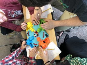
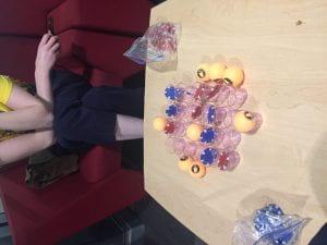
This works intention was to appropriate a childhood game and incorporate adult-life concepts into the gameplay. The childhood game modified for this project was Hungry Hungry Hippos and the concept from adult life was dietary restrictions. I represented prominent symptoms of four human dietary issues through the certain penalties players receive when consuming colored pills. For instance, lactose intolerance is known to cause diarrhea/flatulence, this is represented by the player disposing of half their stomach contents before tallying up points.

I was attempting to change a fast paced game of greed into a slower game of timing a strategy. This was well accomplished after eliminating the hypoglycemic diet. That diet penalty was activated when it did not eat a certain food so it was incentivized to eat more, rather than the other players who were penalized for eating voraciously. Without that intense energy stirring the pills, all the players were more forced to be more cautious when consuming. A strategic element of timing developed which slowed the pace of the game. Players also discovered new ways to manipulate the hippo head. They found stages in its opening depending on how hard you pressed down on the button which they used to help manipulate which pills fell into their mouths.

Balancing the amount and type of pills in play was going to be a main issue to work out. For the first iteration of playlets attempted to work out a decent balance between the pill types by working out percentages and ratios of probability in respect to each hippo. After play testing, slight adjustments were made by one or two units to polish off balance.

My piece Not so Hungry Not so Hungry Hippos comes from the vein of fluxes artists reinventing classic games while weaving in a new narrative or alternate meaning. Yoko Ono’s “Play It By Trust” is a prime example by altering the colors of the classic game Chess to reflect a more serious theme, the pointlessness of war. My piece follows a similar structure by appropriating the classic game of Hungry Hungry Hippos and changing the colors to reflect a new meaning found in adult life.

Appropriation Game: Not so Hungry Not so Hungry Hippos

Game Contents:

  • Game base
  • Four hippo heads and bodies
  • A malleable Clay/Putty substance
  • 43 Marbles
    • 20 Normal Red marbles
    • 23 food marbles
      • 5 Yellow
        • Peanut
      • 5 Pink
        • gluten
      • 6 Black
        • Sugar
      • 6 White
        • Milk
      • 1 Blue
        • Cure-all

How to set up: Start off with all the food units in the eating zone. Fill up each marble release aria with normal (non food) red marbles

How to win: Whoever’s hippo gains the most points after 6 rounds wins.

Rules: Every hippo has a unique dietary restriction. Depending on the diet, the player will receive a penalty upon consuming food units that negatively correlate with their diet. The hippo that collects the one cure-all (blue) marble will not be affected by their diet for that round.

Hippo Diets:

Diabetes

If consumed 3 or more sugar pills in one round, all red pills don’t count

(Symptom: increased thirst and hunger, frequent urination)

Lactose Intolerance

If consumed any milk pills, lose 1/2 of points gained that round

(Symptom: diarrhea, flatulence)

Anaphylaxis Shock

If consumed any peanut pills, pass out for next round

(Symptom: anaphylaxis shock)

Gluten Intolerance

Stick a quantity of putty equal to the size of the pink pills consumed in the stomach of the hippo.

(Symptom: bloating and abdominal pain)

How to play:

Before playing, the players pick dietary issues at random

Once that game begins all the hippos can consume the colored pellets. Once all pellets are consumed, the eating phase ends.

The players then check the contents they have collected. Every pellet counts as a point. Dietary penalties are activated in this phase if a hippo eats a pill that interferes with their diet.

After six rounds the player with the most points wins


Iterations:

Not so Hungry Not so Hungry Hippos underwent 3 iterations. The changes between iterations improved major balance issues and changed the functions of certain diets to bring gameplay closer to a reimagining of Hungry Hungry hippos.

Changes from Iteration 1 to Iteration 2

-Replaced hypoglycemia diet with diabetes diet

-Why: During play-tests, hypoglycemia was at an unfair advantage because it received a penalty for not eating enough sugars. Essentially punished for not eating enough, where the other players were forced to play more cautiously because they can not eat certain things.

-Added 2 more milk and 1 more peanut pill

-Why: To improve balance between the players

-Changed the punishment of anaphylaxis-lips from sticking putty onto the hippos lips too putting putty in the hippo’s stomach.

-Why: The weight of the putty was too much for the hippo eating mechanism to perform effectively, it was too much of a disadvantage.

Changes from Iteration 2 to Iteration 3

-Renamed the ‘anaphylaxis-lips’ diet to ‘gluten intolerance’ and the Strawberry pill to the Gluten pill

-Why: The new rule of putting putty in the stomach of the hippo is more accurate to the sensation of bloating found in gluten intolerant people.


Playtesting:

  • The play testing video below depicts usual gameplay.
  • The play testing video below is when the hypoglycemic hippo was passed out for a turn. This reflects the more cautious gameplay I discussed.


Artwork 2: Appropriation Game

Appropriation Game: THE SHIP OF THESEUS

Gameplay:

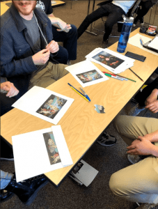
  1. A Judge is picked for the round. For the first round, the oldest player is made Judge. After the first round, the winner of the previous round becomes the Judge
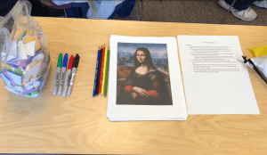
  2. The Judge selects one of the groups of pictures and passes them out to players.
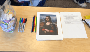
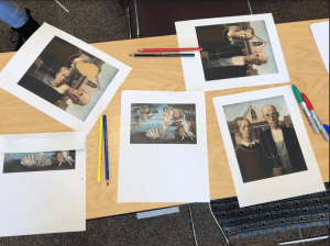
    1. All of the pictures are separated into groups based on what they represent. There’s four copies of the Mona Lisa, Four copies of the Birth of Venus, etc.
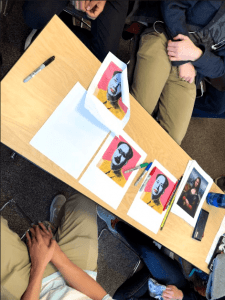
  3. Players are given one minute to transform their image the most while alternating their image the least (The most change with the least effort)
    1. Players can use the tools provided (Colored Pencils, Colored Markers, Felt Stickers), as well as whatever tools they also have (Pens, Scissors, Glue, etc.)
    2. Players can also alter the image physically (rip, fold, etc.)
  4. Once the minute is up, players present their transformations to the Judge
  5. The Judge goes through them all and determines which one they think best meets the criteria
  6. The Judge selects a winner, and returns their transformed image to them. The other transformed images are placed in a discard pile. The winner then becomes the next Judge, and the next round starts.
  7. After all of the pictures have been transformed, players see how many rounds they have won by counting through all of the transformed images they had returned to them. The player with the most won rounds wins the game.

Artist Statement:

The Ship of Theseus is a party game in the style of Apples to Apples in which three players are tasked with transforming pictures of famous paintings the most, while also doing the least amount of work or effort to transform said image. A judge then picks the piece with they think best meets the criteria, and the player with the most rounds won wins the game.

The Ship of Theseus is less a game with appropriated elements and more a game about appropriation, asking questions like “When does something become art?”, and, more specifically to this game, “when does one piece of art become another piece of art?” To a lesser extent, the game is also a critique of the legal processes that affect the art world, because in the end, the guidelines for rulings are vague, and it’s up to a judge to make the final decision.  

The two major inspirations for the game are 1.) Richard Prince and his body of work, and 2.)The Ship of Theseus Paradox, the game’s namesake. The Ship of Theseus Paradox is a metaphysical thought experiment which goes as follows:

The hero Theseus sails his ship into battle, and afterwards it is placed in a museum in the city of Athens as a memorial. After many years, the boards on the ship begin to rot, and one by one the boards are replaced until, finally, none of the original boards remain. Is the ship that’s in the museum now the same ship that entered? If not, when did it change?

This conundrum of identity also affects the work of Richard Prince, whose entire career has been based on the grey zone between altering an existing piece of art and creating an entirely new piece of art. Prince’s 2008 series Canal Zone, and the subsequent legal battle between Prince and the photographer whose work he appropriated, was the main inspiration for the goal of the game.

The images that players appropriate in The Ship of Theseus also draw inspiration from other famous appropriation artists, such as Marcel Duchamp (specifically L.H.O.O.Q., 1919) and Andy Warhol (Mao 91, 1972). On top of that, some of the other art featured (Mona Lisa, The Sistine Chapel, The Birth of Venus) was chosen because, on top of them being famous, they are the kinds of work that the Dada movement was responding to.

Documentation:


The Only Human Defense Force

My current design for this game has deviated a bit from my proposal, so here’s what I’m currently working with:

NOTE: It may enhance your experience to play The Only Human Defense Force before reading about it.

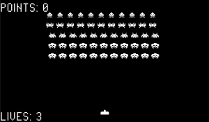
The player finds themself partaking in a game that appears, for all intents and purposes, to be Space Invaders. They are given basic controls (move left, move right, fire) and told to earn points. Aliens advance down from the top of the screen, firing regularly, while the player shoots them down. There are no barriers to hide behind (mostly because I didn’t have the time to program them). The player has three lives.

The first indication that something is off is the score: the player earns no points for killing an alien. By itself, this might seem like just a glitch.

When the player dies or kills all aliens, they are taken to a GAME OVER screen, with a tally of LIVES LEFT and LIVES LOST. However, these tallies display seemingly impossible numbers: 2 lives left, 55 lives lost, for instance. After a moment of thinking, the player may realize that each dead alien is tallied as a lost life.

In addition, the GAME OVER screen displays a message for the player. In order, depending on how many times the player has reached this screen, these messages are:

WHAT MAKES AN ALIEN?

WHO SHOT FIRST? WHO SHOT LAST?

WHAT IF THEY WERE ONLY DANCING?

HOW LONG WILL IT TAKE?

These messages prompt several realizations. The aliens will try to flee after enough of their number are gunned down, for instance. They only fire as many shots as the player fires, never more. And if the player waits and refuses to kill them, one will eventually fly down to make peaceful contact. After this event, the player earns a single point and  is taken to a victory screen that reminds them not to worry too much about earlier failures. After all, they are only human.

It is my hope that this game will inspire players to think about their reasons for responding to situations with aggression and the biases they hold that cause them to do so. Why did they interpret the aliens as aggressive before they had fired a single shot? Why did they not notice that the aliens were only firing in response to their actions? By examining questions such as these, we may be able to break out of real-world cycles of violence with other humans.

Influences  include art games like Mike Builds a Shelter, which inspired an exploration of unusual win/loss states, as well as the Extra Credits episode on Missile Command (https://www.youtube.com/watch?v=JQJA5YjvHDU) and every movie ever where humans overreact to peaceful aliens (Avatar, Arrival, etc.), which always make me angrier than they have any right to. Pretty sure Undertale’s use of traditional gaming motifs in a pacifist narrative has gotta be mixed up in there somewhere, too.

I was really challenged in making this game to find the balance between adding enough explicit Meaning™ that the audience would catch on, while not beating them over the head with a preachy hammer of pacifism. I’m not sure yet if I’ve succeeded.

Download the game here: The Only Human Defense Force

Shot-Pong-Chip

Original Version

In the original version of Shot-Pong-Chip, players take turns placing chips in the shot glasses. When they make a row of 3 continuous chips, they get one point. When they make a row of 4, they get two points. Each point gave the player access to one pong ball which they could use to block off shot glasses without having to “take a drink” (metaphorically, not literally). When the player “takes eight drinks,” they “black out” and must stop playing. The player with the most points wins.

New Version

The new version increased the power of the pong balls to inspire players to remember they do not have to drink every turn and to add more tactical choices to the game. Each player starts with 3 pong balls, and gains one extra one if they gain a point. This ball, if chosen to be used, is taken from a cup in front of the player, which gives them access to the ball but also opens up another shot glass to use on the board. As it plays similarly to a large tic-tac-toe, more chances to actually lock off board spaces allows interesting strategies.

Meaning

I wanted to create something that purposely played with known game mechanics and some game pieces. Similar to Yoko Ono’s piece White Chess, I wanted to have people feel familiar enough with the mechanics, and in some cases the pieces, but used in a different context than they were used to. The game is designed in a way that creates stalemates and/or so that players that choose not to drink much usually lose. This fits into the theme of the game which comments on America’s binge-drinking culture and how nobody truly “wins” in this culture. Because of this, the items of disposable shot glasses, beer pong balls, and poker chips are used in order to drive home the point of collegiate drinking patterns which usually leave people sick, miserable, or in dangerous situations. I purposely chose objects that are used commonly in “drinking games” in order to make a game about drinking, but not one in which the player is recommended to drink. I was somewhat inspired by the idea of “readymades” by using easily obtainable items that were already in form to be used, all they needed was to be put together in the correct context for this game. This also draws from different appropriative Flux-kits which commonly used approrpiated objects in order to present a sometimes game-like artpiece all in one box.

Appropriation: The Game of Love

The Game of Love 


Rules:

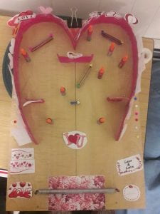
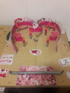
In The Game of Love, you use the spring at the  bottom to attempt to launch a small puck into the three scoring spaces.  The player is able to manipulate the spring in anyway that they deem necessary, as long as it is attached to at least one of the anchoring nails. The  top space is harder to score in, and therefore worth more points.

Appropriations

However, there is no way to track points or to win in a conventional sense. This is partly because of what the game is appropriating. The style of the artifact is based on the old plastic handheld toys like Rings and Pocket Pachinko. These games had self imposed win states and play times, as there were no clear counters to determine points or score. It also takes elements of pinball. The idea is to make something very tactile and playful, where even playing with it feels good. This is to be juxtaposed against the content and building materials of the artifact.  The main board are two detached shelves, and the obstacles are made from old cardboard, dead batteries, electrical bits and bobs, and cheap craft supplies, finally covered in bright pink duct tape and paper cutouts of generic symbols and images of love and romance. It is designed to look kitsch and horrible as a whole and on the exterior, while also having a clearly fumbled together look.

Meaning

The juxtaposition between the kitsch love and romance aesthetic, the disheveled appearance and construction, and the very gamey tactility all come together to represent the worst parts of love in our culture. Society’s idea of love is commercial, it is skin deep, and it is seen in a lot of ways as a game. People and relationships are objectified into raw materials, where game-like tactics and materialism become the background to how achieving love is conveyed. To gamify love in any fashion is to be disingenuous and cynical towards the complexity of relationships and people as a whole.  And in this game, there is ultimately no winning. There is no reward, there are no systems tracking progress or skill. The game acts merely as an instrument for the players amusement, which captures the most cynical and deplorable outlooks on love and human intimacy.

Inspiration:

This piece is heavily inspired by the appropriation pieces in Gallery 360. A lot of them focused on a kind of playfulness that I think is enhanced by the idea of appropriation. There was one piece that was even a game in its own right. I also really liked the Dada appropriation idea of taking a useful object and rendering it useless. In my case, I had many of the artifacts that made up the structural elements of my piece be items that are involved in repair or electronics, such as a spare spring for machinery, batteries, and wire connectors. This also lends metaphorical meaning into the piece. The thing that inspired this piece the most is the Dada idea of anti-art, where one would make something so unpretentious and unappealing that it would subvert expectations in a strange and interesting way.

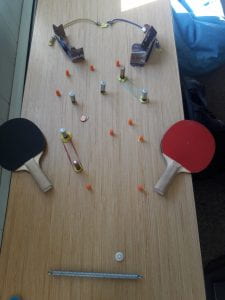
Original Prototype: 

This version was built with constraints of having to be attached to a table, meaning that the only way to play the game was horizontal. This takes out the gravity mechanic that not only makes the game more satisfying to play, but also properly alludes to the material the artifact is appropriating. Play-tests indicated that the difficulty was not properly balanced, and the nature of limitations made it almost impossible to score, which erases how misleadingly satisfying the final artifact is meant to be to play with it.