Eric Crawford

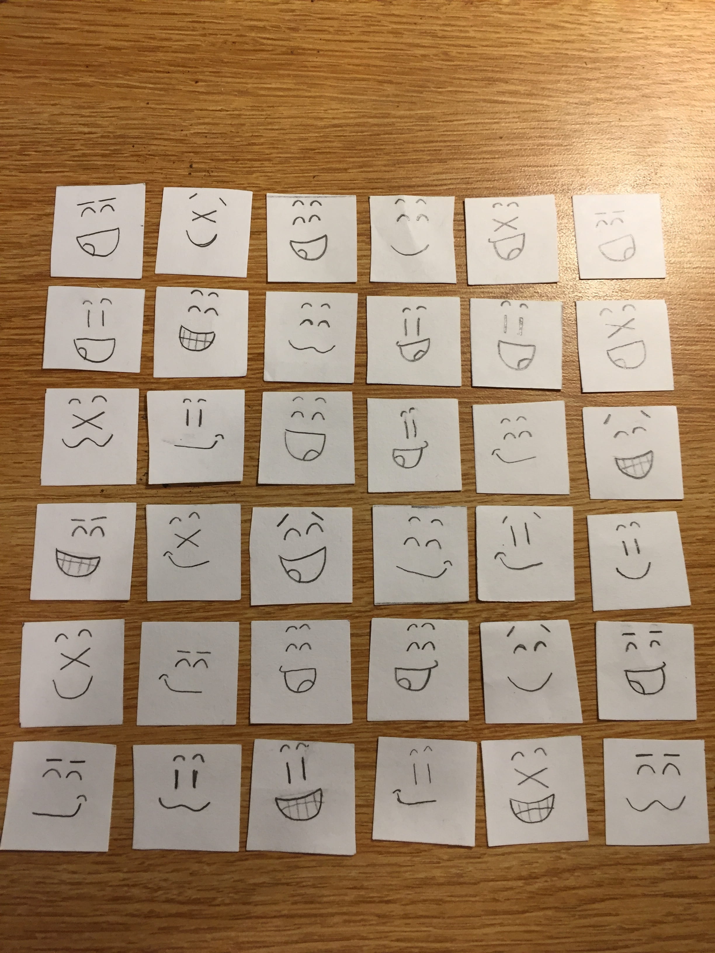
Artwork #4: Ice Cream Social


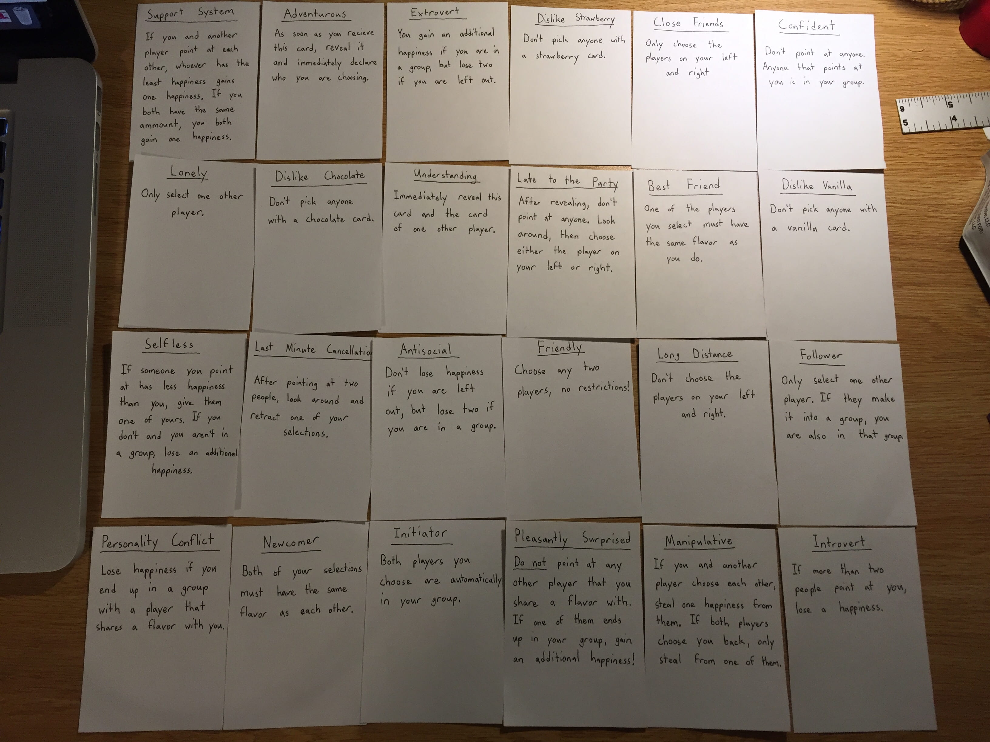
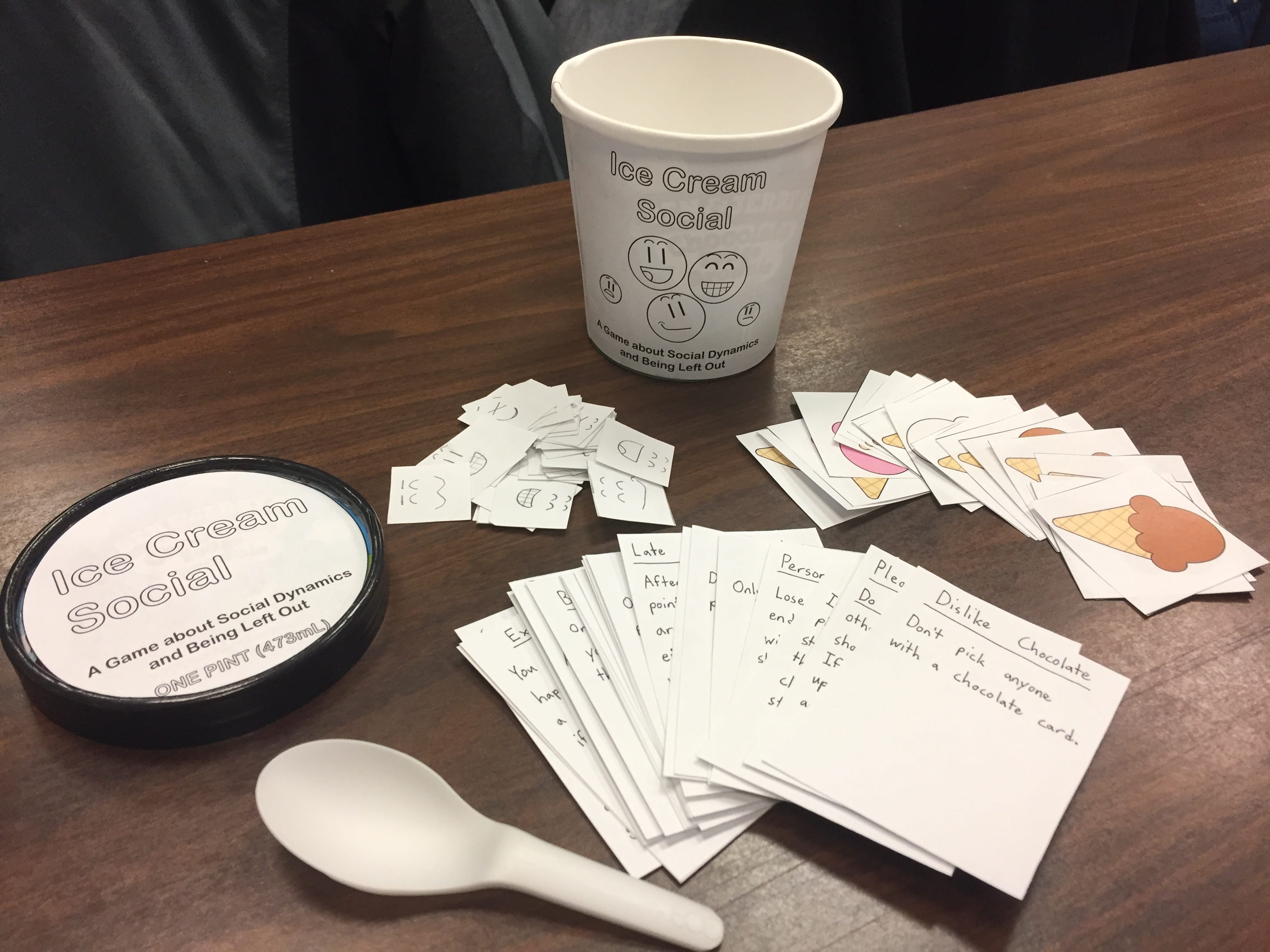
Ice Cream Social is a game about the social dynamics in friend groups and the feeling of being left out.
Rules

Each player is given an ice cream flavor and four happiness tokens at the start of the game. Each round, the player with the spoon distributes a new player card to each person. These cards have roles and instructions on them that dictate how a player must act when the round begins. Any cards that activate immediately are then revealed.

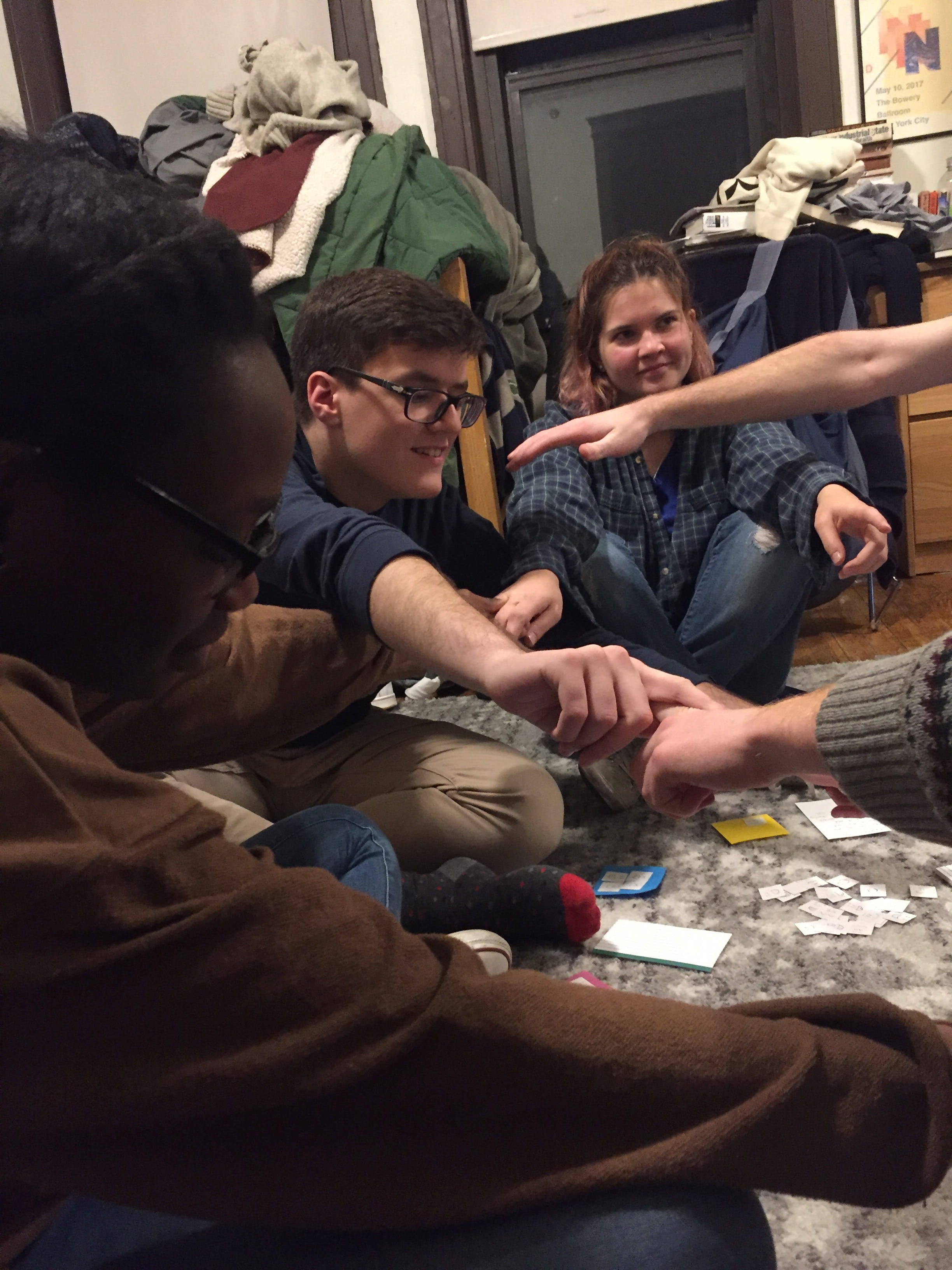
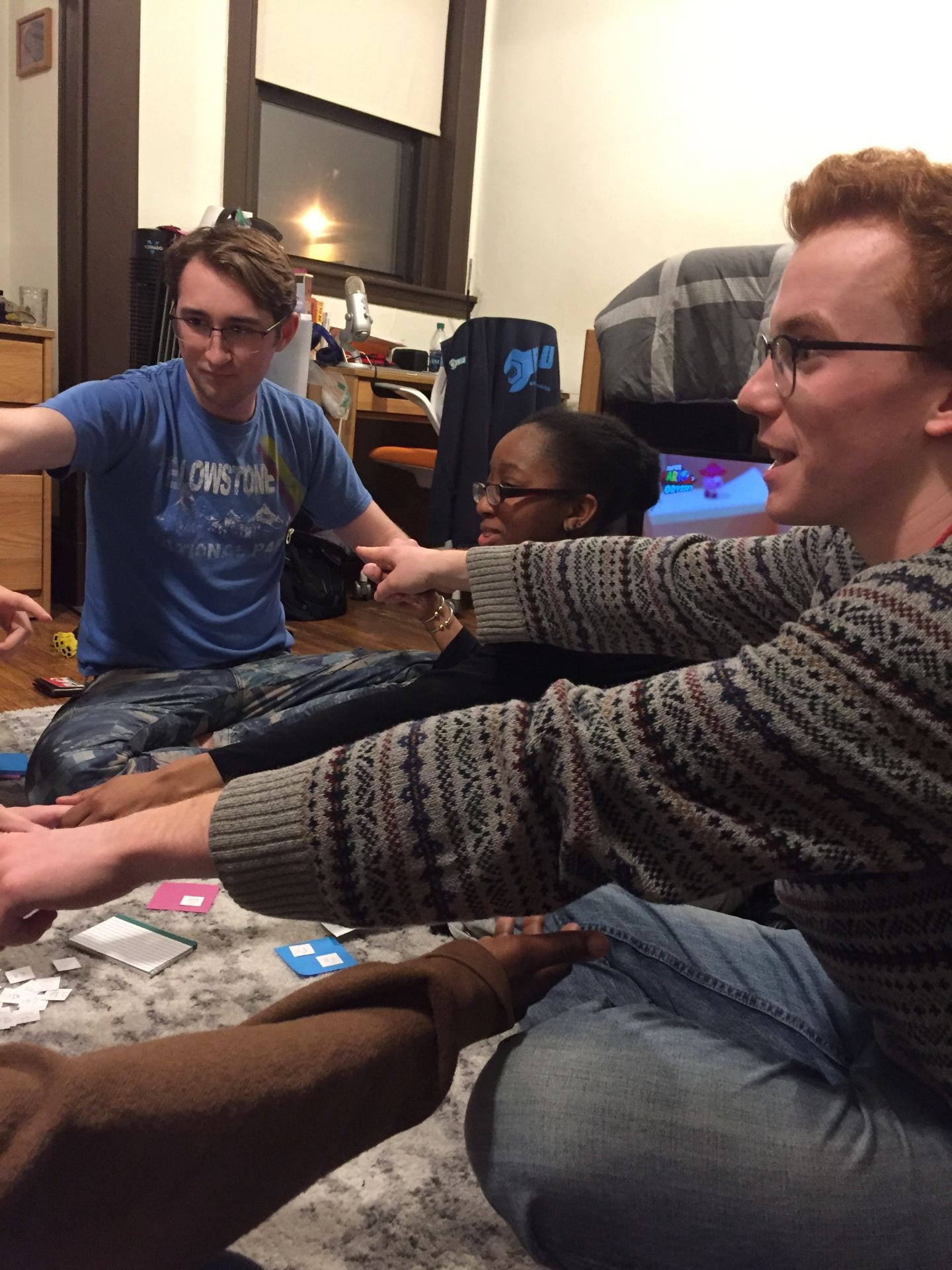
The dealer then counts down from three, and every player then flips their player card upright and reaches out to grab two other players. If two players reach for each other, they grab on and form a group. If any players are not in a group once everyone has reached out, they lose the round and discard a happiness token. The spoon is then passed to the next player. When one player runs out of happiness, they lose and the game ends for everyone.
Artist’s Statement

Near the beginning of the semester I found out that one of my some of my friends were going out to ice cream, so I sent my roommate a text asking if I could come as well, but I never received an answer. He did intend to respond, but forgot to hit send on the message he wrote. I went to bed early thinking that my friends were ignoring me. About a week later the conversation turned to the ice cream run, and only then did everyone involved find out that my roommate forgot to hit send.

I wanted to try to make a game that simulates that feeling, but that was still fun to play. As I tested various versions and added new cards, the game started to become more of an exploration of the different social groups I have been in over the years. Each card in the deck is based on either something I have experienced or someone I have met, for better or worse.

After repeated play tests and tweaks, I feel like I have managed to capture the feelings of trying to manage social dynamics and personal happiness. In each test, people felt bad when they got left out, and some people actually developed grudges against others in the game. People even banded together to try and keep players from going out, despite that being against their goal.
This game was heavily inspired by the things that we learned about tin this class. The presentation of the container and all of the pieces inside was inspired by the various Fluxkits of the Fluxus  movement, as well as the concept of scores. The visual design of each of the cards (and even the container) was inspired by the presentation of scores in Yoko Ono’s Grapefruit. Taking this farther, each player card is also like a mini score that dictates the actions of a player in a given round. The game is also contained in an actual ice cream tub, which I appropriated for this game. As a result of these things and the social nature of the game, as well as the tactile nature of reaching out and holding onto others, the game also essentially becomes a happening in a box.

This game was also inspired by some existing games, and it appropriates some mechanics from them. I took the concept of hidden roles from games like Mafia and One Night Ultimate Werewolf, though without the social deduction aspects. The idea of having two players have to choose each other for things to happen is also inspired by the Jackbox Party Pack 4‘s game Monster Dating Monster.

Initial Concept for Artwork #4: Experience

Near the beginning of the semester I found out that one of my some of my friends were going out to ice cream, so I sent my roommate a text asking if I could come as well. I got no response. He apparently did intend to respond, but forgot to hit send on the message he wrote. I went to bed early thinking that my friends were ignoring me, and he didn’t ask my why I didn’t come because I was already asleep when he got back. About a week later the conversation turned to the ice cream run, and only then did everyone involved find out that my roommate forgot to hit send.

I want to try to make a game that simulates this feeling of being left out for seemingly no reason, but try to do it in a way that is still fun to play.

The best way to do this in my opinion is to make some sort of hidden role game with multiple layers. Each player will have a role visible to everyone (a color, shape, or something similar), and a hidden goal that only they know. Hidden goals would affect things like how players interact with players that have specific roles in each round. One of the hidden roles would be “The Initiator” or something, who would be the person that is inviting people to go do an activity (like getting ice cream, for example). The game takes place over multiple rounds, or “evenings,” with the goal being to try and “hang out” with friends each evening.

Everyone would be given some time to look at their hidden role and colors of everyone else, then each player would simultaneously pick two people to try and “hang out” with. If two people both select each other, they become a group. The two people “The Initiator” picks are automatically in a group with them, regardless of if they returned the pick or not. Points might be assigned for how many people are in a group, though you might just get points if you are in a group at all. There might be a hidden role that tries not to get in a group or something, but we’ll have to see how testing goes.

This idea is partially inspired by the games of Mafia and One Night Ultimate Werewolf, though without the social deduction aspects of those games. The idea of having two players have to choose each other for things to happen is also inspired by the Jackbox Party Pack 4‘s game Monster Dating Monster. I am also inspired by Yoko Ono’s “White Chess,” and how it makes it very hard to tell who is on what side. I want to try and recreate that feeling in this game.
Indie Show and Tell: Kairo

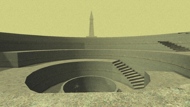
Kairo is a first-person atmospheric puzzle game, or what many would refer to as a “walking simulator.” All interaction with the world and the puzzles is done through manipulating the player’s position. The only things you can do in the game are walk, run, jump, and look around.

While the game never explicitly gives you a goal, the spaces and puzzles slowly guide you to set the machinery of the world into motion, unlocking new areas. At any time you can go explore the places you have already been; there are no one-way gates blocking you from going back, though there’s not much of a reason to do.

There is no text in the game, save for the menus and a few lines after the credits. All of the story is told through environmental details, visuals, and excellent sound design. The story slowly unfolds as you discover images and sculptures. There are plenty of hidden areas that lead to scenes that also help tell the story, but they are very, very difficult to find. They are only necessary for the secret ending.

The story is told non-linearly and starts in medias res. The story isn’t really about you, it’s about Kairo and what it does and why it exists. Who you are is relatively inconsequential to the plot; anyone could take your place and it would function the same. Because of all these factors, the story can be somewhat difficult to fully make out, though I thought it was clear enough to keep me motivated. Feel free to look up the plot once you finish, the creator of the game has confirmed that several analyses of the game’s plot were correct.

I really like Kairo, but it’s not for everyone. If you like walking simulators, you’ll probably enjoy it. The atmosphere of the game is incredible, with a unique visual style and a haunting soundtrack. If you don’t like games entirely based around atmosphere and exploring empty spaces, there’s not much to do in the game other than think and look at the cool architecture.

Relation to Avant-Garde Videogames : Playing with Technoculture

If I had to put this game on the Radical-Complicit/Political-Formal chart that Schrank uses organize the chapters in his book, I’d place it as Complicit and somewhere between Political and Formal. The game doesn’t really do anything radical, but the gameplay of walking around in Kairo alone leads to deeper meaning when placed in the context of the story that the game tries to tell. Combining these factors leaves me unsure of how to categorize it other than “somewhere in avant-garde.”

This article describes the game rather well: https://www.rockpapershotgun.com/2013/04/23/wot-i-think-kairo/

MASSIVE SPOILERS AHEAD

read more…

Artwork #3 Intervene: Walking in Sync

For my intervention, I wanted to do something noticeable but subtle. Something that people not involved would look at and think about, but not something terribly disruptive in the place where it occurred. In some ways it worked and in others it failed; I’m not sure if I was successful overall.

I was mainly inspired by the group Improv Everywhere and their piece “Frozen Grand Central.” The idea of doing something in a public place that get people to look and ask questions is very cool to me, so I wanted to do something similar. Everyone freezing in place would have been ripping them off, so I decided to do the opposite and have a bunch of people do the exact same thing.

The Plan

My original plan was to start out walking alone, trying to stay in step with a stranger walking in the same direction as myself. As I walked the route I planned others who were in on it would join in as I passed, walking in step behind me. The farther we went, the longer the chain would become. I hoped that at some point strangers would decide to join in. Once we got to the end of the path, we would just stop and disperse, leaving anyone watching or participating amused and confused.

This plan didn’t happen. I tried several times to get enough people to help me, but I could not find enough people due to my friends having busy schedules on weekdays. I tried to design routes for less and less people, but I eventually decided that I would have to stage it in class.

Observations

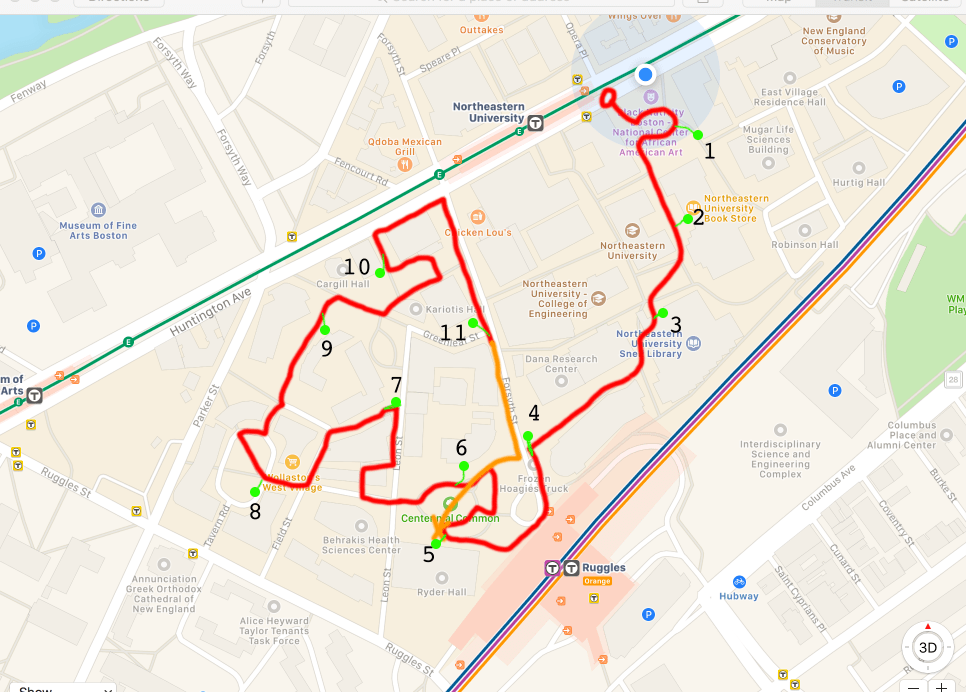
I created a new route that only looped around Centennial Commons, and briefly described the premise to the class. I didn’t end up describing or planning it out well enough, which seems to have led to confusion during the walk. Regardless, it seemed to start out okay.

From what I could tell people noticed, but did not react much. There are usually people hanging around Centennial working on homework or meeting with friends, and I expected them to watch us while walking or perhaps even join in. Unfortunately it was a rather cold day and there was nobody hanging out in the Commons, only people passing through. I hope that the people who noticed questioned what was going on and thought it was interesting, but I’ll never know.

I also feel like I may have overestimated the ability of a large line of people to stay in step with each other, though it was hard to tell from the front of the line. To me it’s easy to follow people in step, but I was in a marching band for four years. I’ve had plenty of practice. If I were to do this again, I’d make sure all of the participants had practiced before starting.

Other Notes

I’ve begun to notice a pattern with a lot of my own art. I feel like I’m obsessed with trying to get people to notice the details in the world around them. I have no way of knowing how other people think or feel, but it seems to me that a lot of people don’t take the time to notice the world around them and appreciate it.

I want to make people happy. I’m not sure how to classify my views on purpose and life, but I’ve thought a lot about why I exist. I don’t have any profound wisdom on the subject, and I’ve never taken a philosophy class in my life, but thinking about this stuff has led me to develop an outlook on life that makes me feel content in my place in the universe. By the time I leave this world, I want to have left a net increase of happiness from my existence.

I like to think of myself as a happy person. Most of the time I am. I like to smile, I like to see friends, I like to play games. I want to share that feeling of happiness and contentment with others, but I don’t know the best way to do that. Taking time to appreciate the complexities of the world is how I find my happiness, so I think that’s why I keep making projects that try to get people to notice the world around them more; to notice the things that I do.

Every aspect of a building was decided by someone. Not all decisions were made by the same person, but everything was decided by someone at some point. Some designer decided a building should have a brick wall, and some builder decided to put one specific brick where it is for some reason or another. It might have been the first one in the pile, it could have just felt right for them to put it there; I’ll never know.

To me, the existence that we experience is a result of this incredible clockwork of reality, and it’s beautiful and comforting. It makes me happy to think about what led to a leaf falling in to exactly where it lands, why my desk is exactly 107 centimeters wide, and how the stitching holding a shoe together is designed for that specific task. The world and all of the coincidences and decisions and processes and accidents that have led to this exact moment are beautiful and overwhelming, and I just want to share that with people.

Maybe all of this sounds like pretentious garbage, I don’t know.

Like several of my other projects, I want to try to get people who notice it to question what is happening. I want people to stop and appreciate the moment, with a dozen people randomly walking in step. I want people to talk about things that they notice with others.

I just want to make people happy.

I’m not sure if I managed to do that with this project.

Indie Game Show and Tell: Superbrothers: Sword & Sworcery EP

Superbrothers: Sword & Sworcery EP is a really strange game. I love it. It was a collaboration between musician Jim Guthrie, the game studio Superbrothers, and publisher/developer Capybara Games.

It initially released for iPad on March 24, 2011 with an iPhone version about a month later. A Steam version was released in April 2012, with an Android version later in December. I’d recommend the iPad or Steam version, the small phone screens don’t do it justice.

I’m going to try really, really hard to write this in a way that doesn’t spoil the game, though the nature of the game makes that very hard. It really doesn’t want to fit in a specific genre of game, so the best I can do is say that it’s a 2D adventure/puzzle/rhythm game told in second person. It’s really hard to describe. I recommend going in completely blind, preferably alone and wearing headphones.

Here’s a mostly spoiler-free synopsis: the plot centers around a mysterious book called The Megatome, and follows a character only known as The Scythian trying to complete her “woeful errand.” Saying any more would ruin the game, as slowly piecing together the reasons for your actions is a major part of the game.

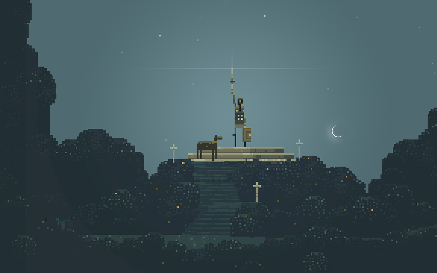
The artwork and sound design in this game is amazing. The visuals are a beautiful mix of pixel art and smooth geometric shapes unlike anything I have seen before or since. Jim Guthrie did an amazing job on the sound design. The music is incredible, and it has such an important role that the game has EP in the title. I still listen to the soundtrack regularly, and I was listening to it while writing this blog post!

The art, sound, and gameplay all work together to create an amazing sense of atmosphere that few games have managed to pull off. At times the game is calm and reserved, and at other times it is actively trying to terrify you. It’s an emotional roller coaster from start to finish.

Minor spoilers follow, you have been warned.

read more…

Artwork #2: Corruption Game

Overview

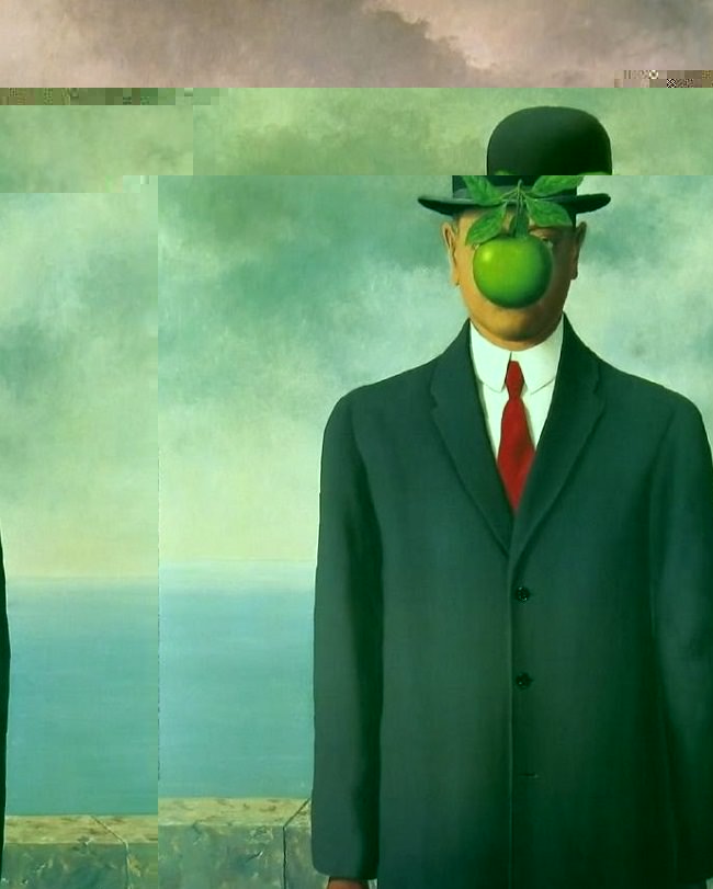
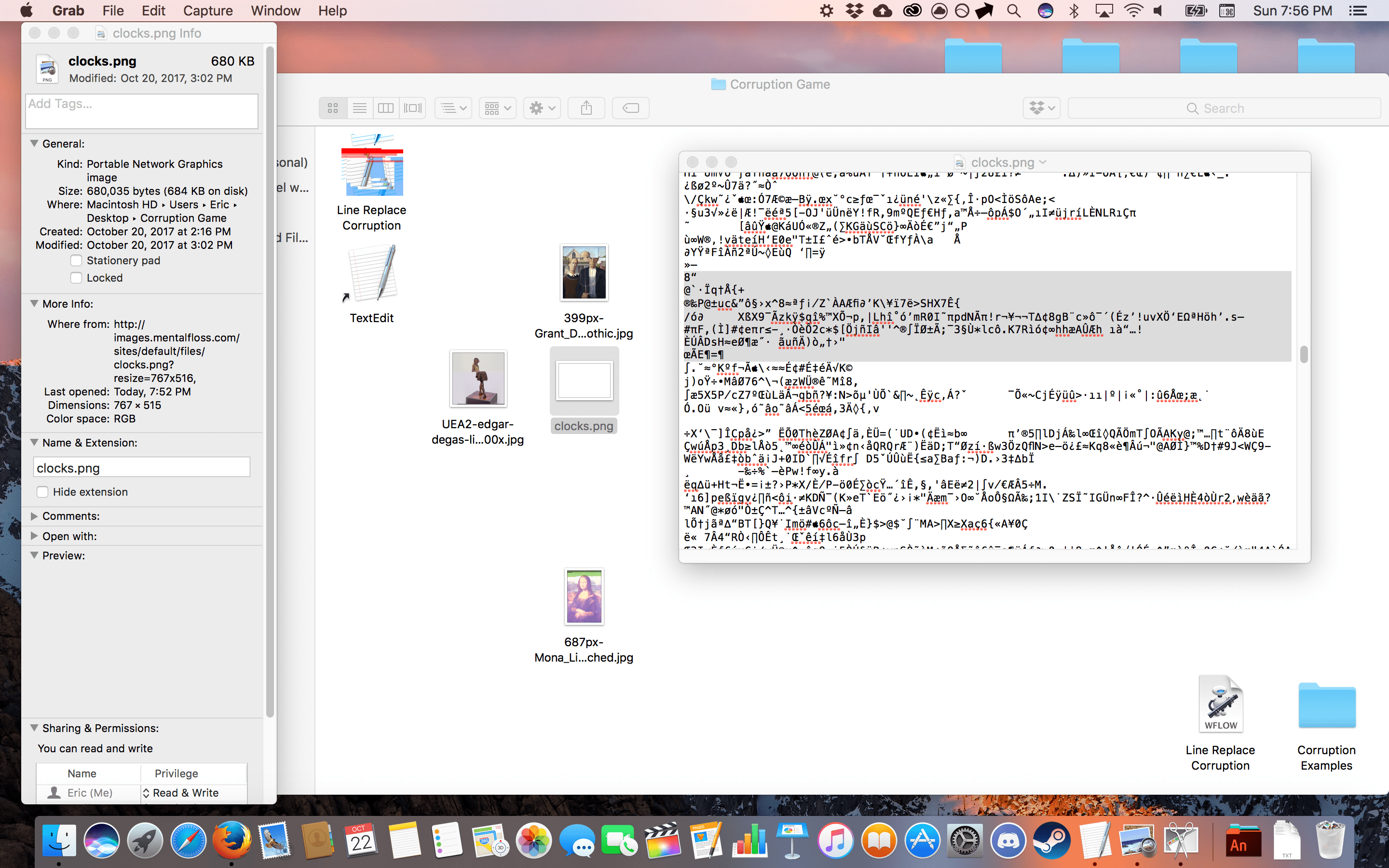
For my game I decided to not appropriate an existing game outright, rather I appropriated concepts from existing things to create something unique. The resulting game is designed to draw attention to the fact that image files on computers are just information, and by combining information from different sources we can create surprising new outcomes and discoveries. This is done by taking image files and embedding them with information about the artist, the subject, the file’s metadata, and more into the file itself. The results can look something like this:

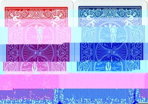
The game appropriates the text editing program TextEdit into a photo editing program by having players open images as text files. The Mac batch processing utility known as Automator was also appropriated into a system that automatically corrupts files based on inputs to make the game easier to operate. The icon I made for this program is a corrupted version of the TextEdit icon. The cards that the game are played with also use appropriation; they have classic bicycle playing card backs, though they have been corrupted as well.

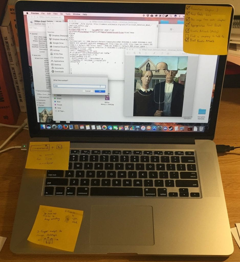
The game also appropriates the MacOS operating system to a certain extent as well. Each player is given their own desktop and have to navigate and manage several different windows to complete their turn. The setup for each desktop was intentionally awkward to navigate, and the computer was also littered with sticky notes with lists of homework I appropriated or made with an equal number of hints and irrelevant information.

The idea of drawing attention to the media being used was taken from René Magritte’s La trahison des images (The Treachery of Images), some of the gameplay mechanics are taken from the board game Ticket to Ride, and the idea of a hybrid board-and-digital game was taken from Mansions of Madness Second Edition.

Individual players also choose an art piece to appropriate themselves at the start of the game.

The Setup

Each player chooses a well-known work of art that has a Wikipedia article, and downloads a “medium size” image of it using Google Images. Medium-sized images seem to work the best; too small and the image will completely break after one turn, and too large and it won’t corrupt easily.

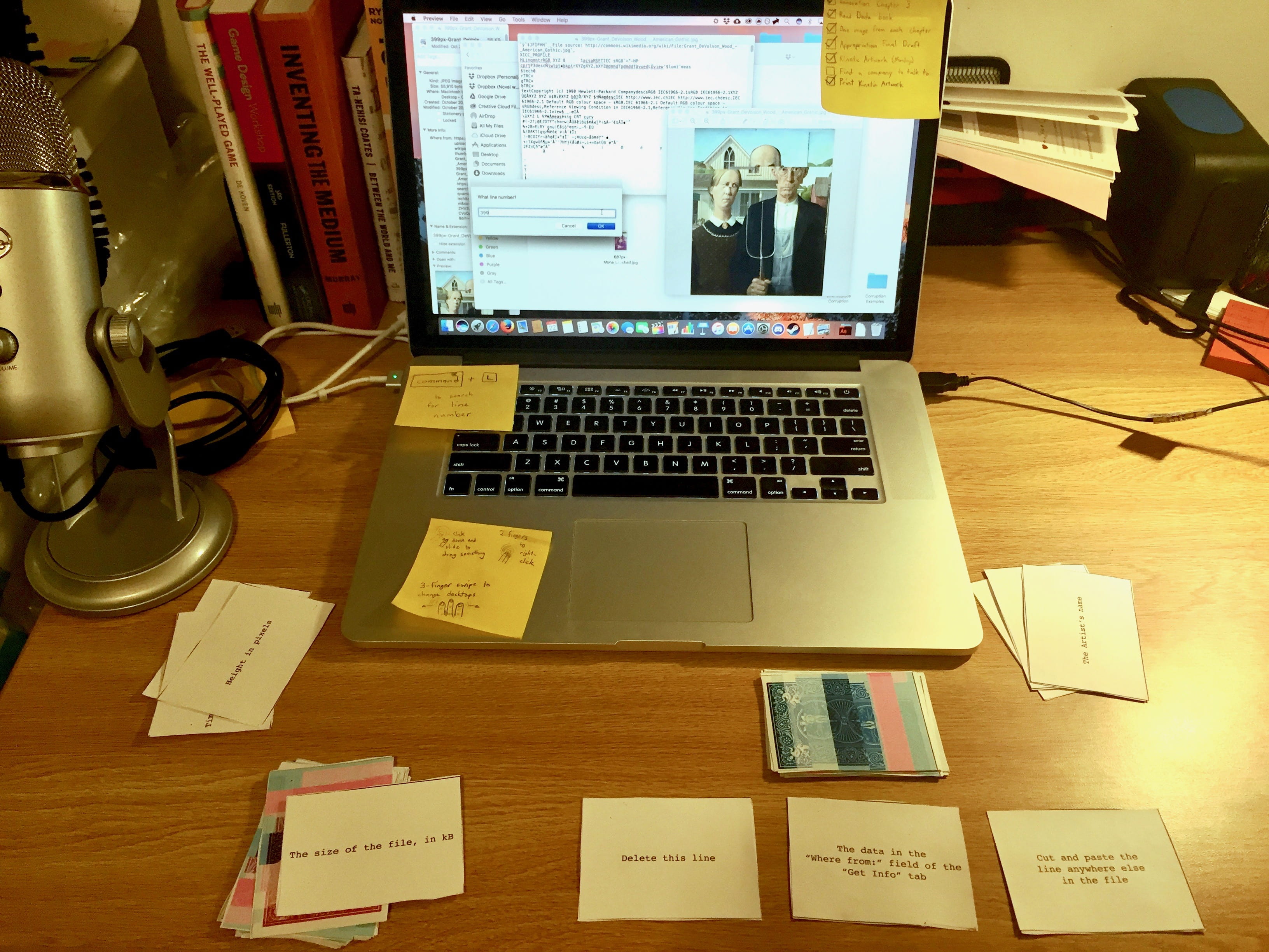
A internet browser is opened with a tab for each piece with the corresponding Wikipedia articles open. Each player creates a new desktop and opens the Corruption Game folder, then places their image inside. They then right-click (Command-click) their image and choose “Get Information” to bring up the metadata for the file. The red Line cards and blue Data cards are placed in two piles, face down, within reach of all players. Three Data cards are flipped face up and placed in a line, this is the selection pile. When a card is removed from the selection pile, draw another Data card to replace it. After each turn, discard the cards that were used in that turn. The setup should look something like this:

Gameplay

At the start of a player’s turn, they then draw one Line card and choose one Data card from the selection pile. They then drag their image file onto TextEdit or the Line Replacement Corruption file, depending on what the cards require of them. The line card tells the player which line of the image-opened-as-text-file to navigate to, and the Data card tells them what information to replace that line with or what to do with that line. After the operation has been done, players save the file and close TextEdit.

Side note: The Line Replacement Corruption app automates the corruption process, but is very limited. It asks the player for a line number, then asks the player to copy what they want to replace that line with to their clipboard. It then pastes that into the file and automatically saves and closes TextEdit. This makes some turns much shorter and easier, but it cannot handle any of the more complicated Data cards such as deleting a line or cutting and pasting the line somewhere else. With the more advanced Data cards, the player must do them manually in TextEdit.

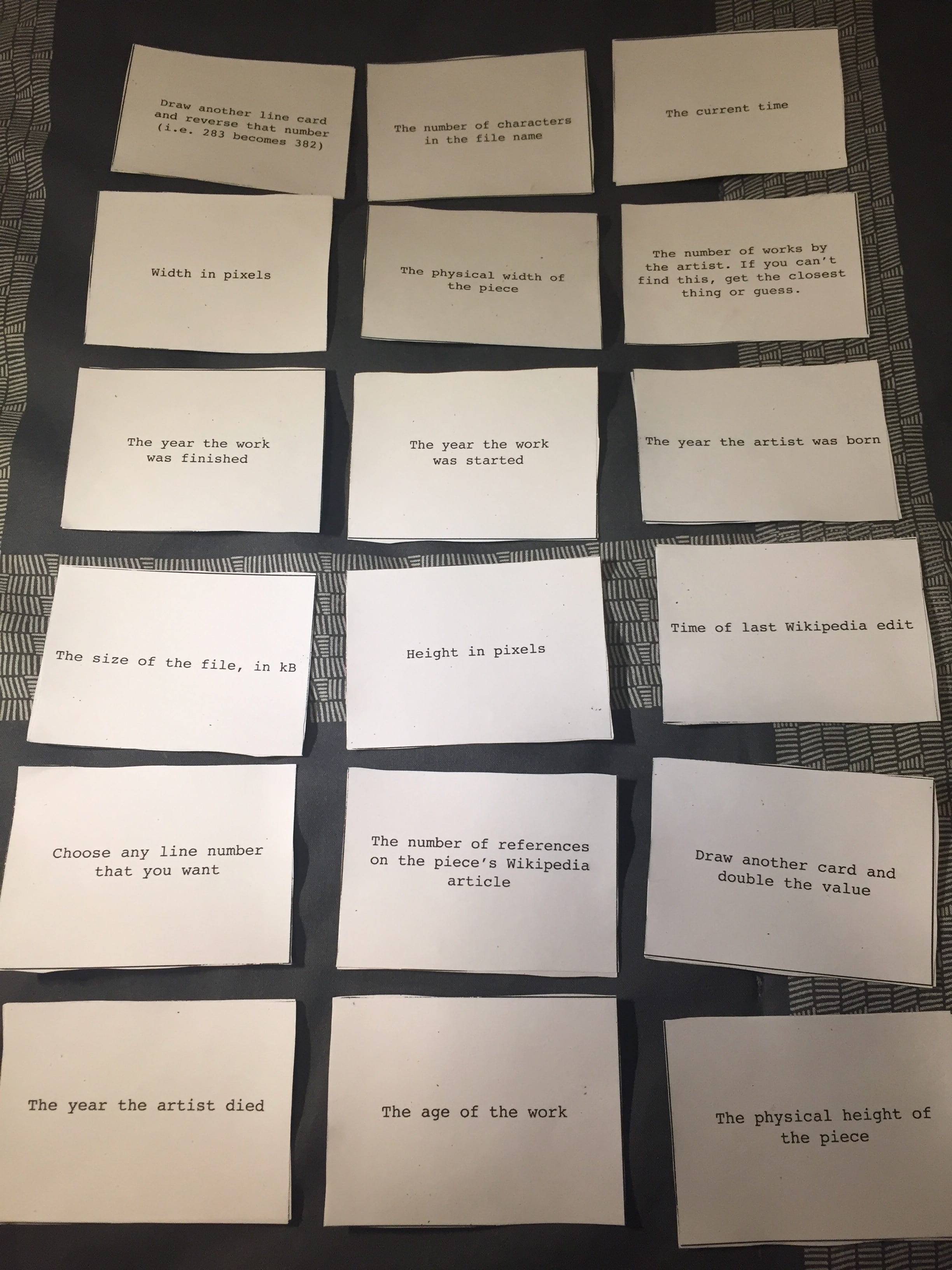
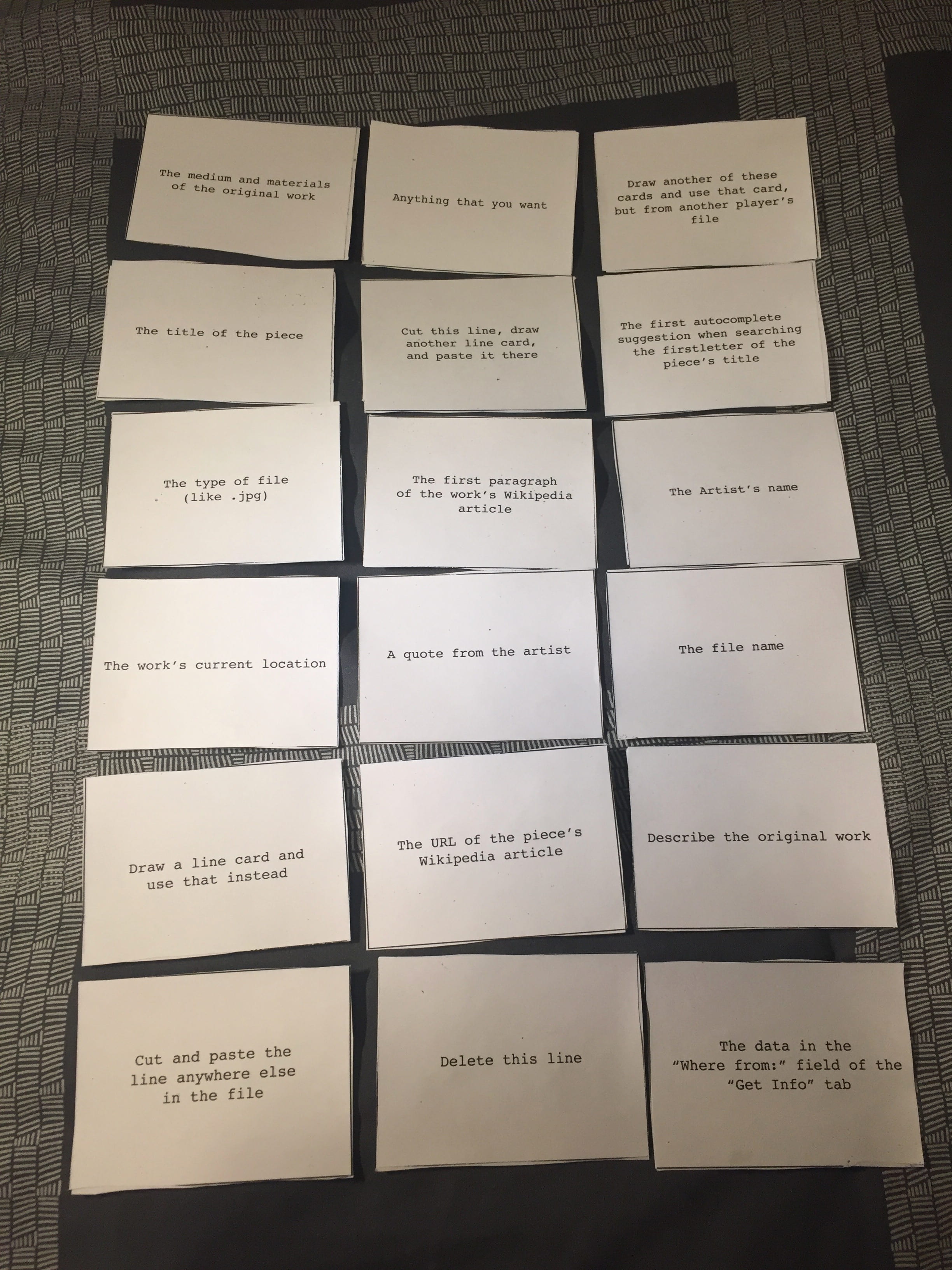
All of the Line cards will result in a number. If TextEdit or the Line Replacement Corruption app cannot find that line, remove a digit from the far left or right of the number until it works. Here are the possible Line cards, followed by the possible Data cards:

Players take turns drawing cards and editing files for a predetermined number of turns. Everyone then looks at the resulting files and votes on which is their favorite, and the player that receives the most votes wins. If a file becomes corrupted to the point that it will not open, that player cannot win.

Examples of Finished Games

Here are some examples of the images that were corrupted during play testing!

Original: The Little Fourteen-Year-Old Dancer by Edgar Degas

Original: The Last Supper by Leonardo da Vinci

Original: American Gothic by Grant Wood

Original: The Persistence of Memory by Salvador Dalí

Artist’s Statement

In terms of inspirations, the game itself is pretty much a collage of ideas from different works and games. Earlier I noted that I was inspired by René Magritte’s La trahison des images (The Treachery of Images), and how it draws attention to the fact that it is simply a representation of a pipe, and not actually a pipe.  Another inspiration was the Berlin strain of Dada’s use of collage and photomontage, particularly the works of Hannah Höch. My game encourages players to create a sort of “collage” out of metadata and display it in a visual way.  While the result might not look like a collage, in a way it is. Digital images are just information, and combining information can create new information.

Playing off the idea of taking information and rearranging it into something different, I was also inspired by the works of Hannover Dadaist Kurt Schwitters. I was particularly inspired by his poem “An Anna Blume, and how he takes the familiar form of a love poem and twists it into something different  and chaotic. My game takes familiar images and twists them into something different and unexpected as well.

The Original Prototype

Not much of the gameplay changed between the final and the prototype, though the aesthetics changed quite a bit and the flow of the game was polished up.

The initial prototype was played with hand written index cards. There were 17 cards of each type, as opposed to the final number of 18 for each in the final. The wording on several cards was reworked to be more clear, and a Line card about the estimated value of the work was removed entirely for both being difficult to find the fact that the resulting number was often far to large to work with.

I was really worried that people would get bored waiting for their turns after the initial test of the prototype made it clear how long the turns took. I solved this with a couple of additions to the game for the final version: new card drawing mechanics, the Line Replacement Corruption app, and shortening the game.

In the prototype, both your Line and Data cards were drawn randomly. This didn’t feel very good, as you had no control and spent the time between your turns not engaging with the game. Giving the player a choice between face up cards lets the players who are waiting for a turn something to look at and plan with, as well as give the player taking their turn some control over the outcome of the game.

The other way I tried to make the game more fun for the players waiting to take a turn was to speed up the turns thought the Line Replacement Corruption app. As stated earlier, it partially automates the corruption process (depending on the cards drawn) to make turns faster. This seemed to work well, as many turns were shorter as a result of adding it.

I also addressed the issue by switching from using all of the cards in the game to deciding on a number of turns that each player can take.

During the testing of the final version I noticed that people enjoyed watching other players take their turns. It seems to be due to the semi-random nature of the corruption; people want to know what’s going to happen to the picture.

Below is a download for the Corruption Game folder that includes the Line Replacement Corruption app, all of the visual assets used in the game, and several examples of finished corruptions. It was designed for and will probably only work on a Mac.

https://www.dropbox.com/s/97e79rx2iw33tae/Corruption%20Game.zip?dl=0

Appropriation: Neil Cicierega’s Mouth Sounds Trilogy

Neil Cicierga is a comedian, artist, and musician, known for his web series Harry Potter Puppet Pals, his musical works under the name Lemon Demon, and a creating a style of flash animation known as “Animutation.”

Recently, Neil has been gaining notoriety for something else; he has been producing mashup albums under his own name that consist of almost entirely appropriated sound clips. The first and second albums, titled “Mouth Sounds” and “Mouth Silence,” were both released in 2014, while the third, “Mouth Moods,” released earlier in 2017. These have been referred to as the Mouth Trilogy due to their titles and recurring use of the song “All Star” by Smash Mouth.

The albums grew out of Neil’s discovery that the Rock Band series of video games includes separate stems for every instrument in the game, allowing him to pull individual parts out of the songs. Most of the songs on the albums involve fitting the vocals of one track to the backing of another, and a good example from Mouth Sounds is “Bills Like Jean Spirit.” The track consists of the lyrics to Nirvana’s “Smells Like Teen Spirit” over the backing track for Michael Jackson’s “Billy Jean.”

Not all tracks follow this format though. “No Credit Card” only uses Huey Lewis and the News’ “The Power of Love,” while the track “D’oh” uses at least six distinct sources.

Neil has stated that Mouth Sounds was created to make people laugh, and also to offend the fans of the tracks that he used.

While Mouth Sounds has the reoccurring element of Smash Mouth’s “All Star,” it is replaced with the song “Semi-Charmed Life” by Third Eye Blind in the “prequel” album, Mouth Silence. Notable tracks that use this include the opening track “Goodbye,” and finale “Piss.” Despite this, All Star is referenced in various ways. The wispy wind sounds found throughout the album are actually samples from All Star slowed by 1600%, and the Morse code found in the album’s climactic finale “Piss” translates to “Somebody once told me.”

Mouth Silence also introduced “themed” tracks to the albums, tracks that exclusively use songs that mention a specific word. My favorite is the track “Best,” which includes samples from the Rockapella’s Folgers jingle, One Direction’s “Best Song Ever,” Tina Turner’s “The Best,” and the Pokémon theme song.

On January 23, 2017, Neil Cicierga released the most recent album in the series, “Mouth Moods,” which features much more involved mixes than the first two. The average number of sources is around 4.5 per track. This album’s recurring element is “One Week” by Barenaked Ladies, though All Star and Semi-Charmed Life make prominent appearances as well.

Notable tracks include “Wallspin” (Wonderwall and You Spin Me Round (Like a Record)), “T.I.M.E.” (Hans Zimmer’s Time from Inception with Y.M.C.A), and “Mouth Pressure” (All Star and Under Pressure).

All three albums have been met with almost universal critical praise.

http://www.neilcic.com/mouthsounds/

http://www.neilcic.com/mouthsilence/

http://www.neilcic.com/mouthmoods/

Walk Home


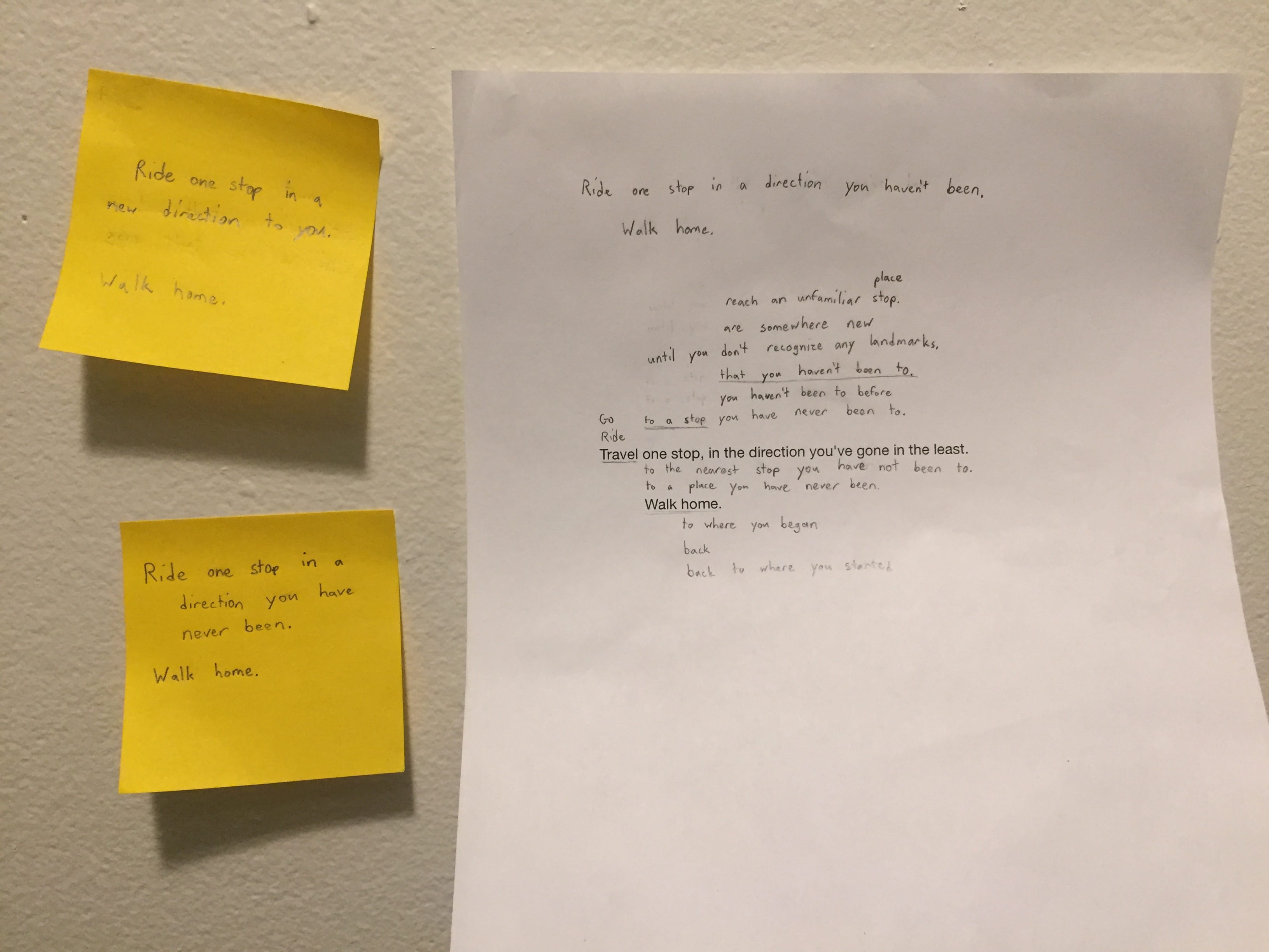
Travel to a stop that you haven’t been to. Walk home.


Artist’s Statement

The score Walk Home was inspired by several different things. The language and style of the score was inspired by some of Yoko Ono’s works in Grapefruit, while the subject was inspired by my fascination with public transportation systems and the Fluxus artist’s fascination with the mundane. The placement of the words on the page and the font were inspired by the fantastic interactive novella/game Device 6 by the group Simogo.

Like many of Ono’s scores in Grapefruit, I tried to keep the language of my score as short, simple, and vague as possible, while still communicating my ideas. Sentence structures were altered, traveling in a new direction became traveling to a new place, and restrictions on distance were removed. Despite having gone through several revisions, the words “Walk,” and “Home,” were never changed, though a replacement for home was considered several times.

I’ve always been fascinated by the fact that there is so much in the world that I will never see. Sure, there’s parts of the world I’ll never visit and even places in this country I’ll never get to see, but sometimes the places that fascinate me the most are the ones just down the street. The mundane, everyday places that aren’t necessarily special in any way, like the left fork of the neighborhood that I live next to. I’ve been to the right one several times, but I’ve turned left there. Someone spent a significant amount of time designing the houses on that street, but most people will never even think about that; it’s just a line of houses on a street, there’s thousands more streets like it.

Public transport fascinates me for similar reasons. There’s this massive interconnected system to take people where they need to go, but everyone is going somewhere different. Most people will only end up using a small portion of it on a daily basis, and few people will ever visit every stop in a system. Despite this, every detail of every station had to be designed by someone, and most people never stop and think about that. Which plants to put in a flower bed, the location of each request stop button on a train, the distance between the floor and the ceiling in a building, each decision was made by someone for a particular reason, and I don’t think that most people take the time to think about that.

One of the most interesting things that I noticed while testing and tweaking Walk Home was how the participants slowly begin to recognize their surroundings until they suddenly realize where they are. It gives them the chance to view something familiar in a new way and see details they may have missed.

Below is an audio log of a performance of Walk Home done by myself on the night of Monday, September 25th. I traveled outbound from the Northeastern Station of the Boston T system’s Green Line to the Brigham Circle Station, after which I walked home. In addition to the audio log, there is also a photo of several early versions of the score.